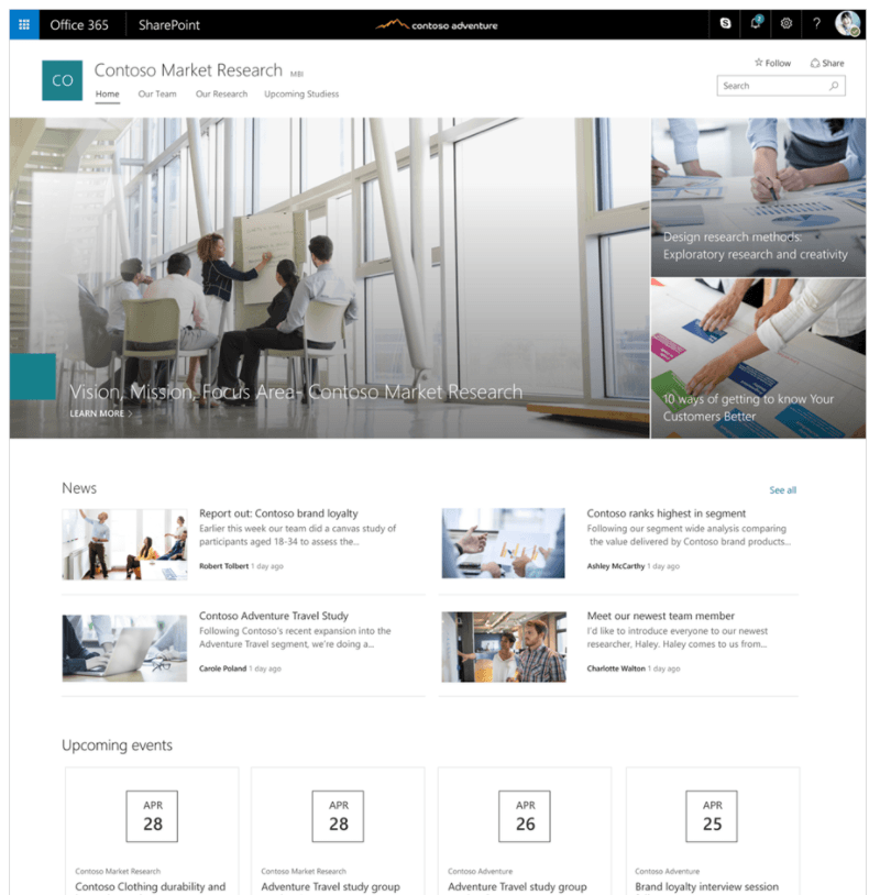
Microsoft just told the world that the so-called Communication sites are rolling out to 365 tenants. Here is a quote on the intended use:
Communication sites are perfect for internal cross-company campaigns, weekly and monthly reports or status updates, product launches, events and more. To help you jumpstart getting your message out fast, communication sites provide configurable templates for the sites and pages within.
Ah, yes! Everything we as communicators do is to create cool looking images, with action-inspiring text, based on templates. Yes, I know I sound a bit harsh here, but in all fairness: Anything you call Communication sites should be richer than this. I have written about the changing communications landscape before and anyone listening to professional communicators on Twitter or the like know that communicators have since long passed the times when pretty images were everything. Then we look at Microsoft’s own example from their site:

Microsoft highlights BI functionality in the launch article, but I expect more clarity and insight. If the Communications sites should really help companies, it would have been cool if Microsoft spoke to some professional communicators first. Maybe they have, and maybe more is coming. But given the message in Microsoft’s current material, I get the feeling that as long as you know Photoshop, you’ll be fine. I look forward to people proving me wrong.
